Granja Las Acacias — Human-Centered Culinary Experience & Brand Identity
A rural gastronomic refuge built on deep empathy, family heritage, and human connection—transforming authentic hospitality into an unforgettable brand experience.
Hospitality
2025
The Strategic Concept: A Home Blooming for the World
In an era of hyper-commercialized dining, authenticity cannot be fabricated—it must be cultivated. Granja Las Acacias is a farm-to-table gastronomic sanctuary where family heritage, local ingredients, and rural life converge into an immersive experience.
The primary brand challenge was not just creating a logo for a restaurant, but structuring an emotional ecosystem capable of scaling a family's personal warmth into a professional hospitality asset.
Empathy as Design Strategy: The Human-Centered Engine
At the core of this project lies the Empathize phase of Design Thinking. Instead of conducting distant market research, we immersed ourselves in the daily rituals, fears, and hopes of chef and founder Juan Pablo Osorio and his family:
Mapping Human Relationships: We mapped the invisible emotional pillars holding the project together—Ángela's maternal tenderness, Don Juan's tireless resilience, and Andrea's steadying belief through moments of doubt.
Decoding Farm Identity: We humanized every element of the land—from the two twin acacia trees guarding the entrance to the named animals that inhabit the farm (Candy the goat, Chepe the goose, the sheep family).
Translating Emotion into Hospitality: Empathy allowed us to turn personal family recipes into brand touchpoints, ensuring visitors feel like welcomed guests rather than transactions.
Brand Symbolism: A Floral Heraldry of Hospitality
The visual identity was built on custom brand storytelling and deep floral symbolism, redesigning traditional coat of arms heraldry into a "Shield of Love":
The Precursor Petal (The Leader): The top red acacia petal represents Juan's courage to lead the vision.
The Four Sustaining Petals: Representing the foundational pillars—Care (intuitive service), Home (the shared table), Food (farm-to-fire cuisine), and Farm (coexistence with nature).
The Central Star & Supporting Dots: The central star marks the gather point of warmth, while the three dots above honor the parents and partner whose steady support sustains the journey.
Rustic-Refined Color Palette: Organic tones including Acacia Berbellón (
#ED1C24), Terracota Comensal (#C13818), Oliva Terrestre (#3F4624), and Beige Horneado (#829E7B).
Design Beyond Graphics: Scalable Touchpoints
The design system extended far beyond paper to create an immersive physical environment:
Wayfinding & Animal Signage: Character-driven wooden signage detailing the playful personalities of farm animals ("Candy the goat: watches out on Tuesdays...").
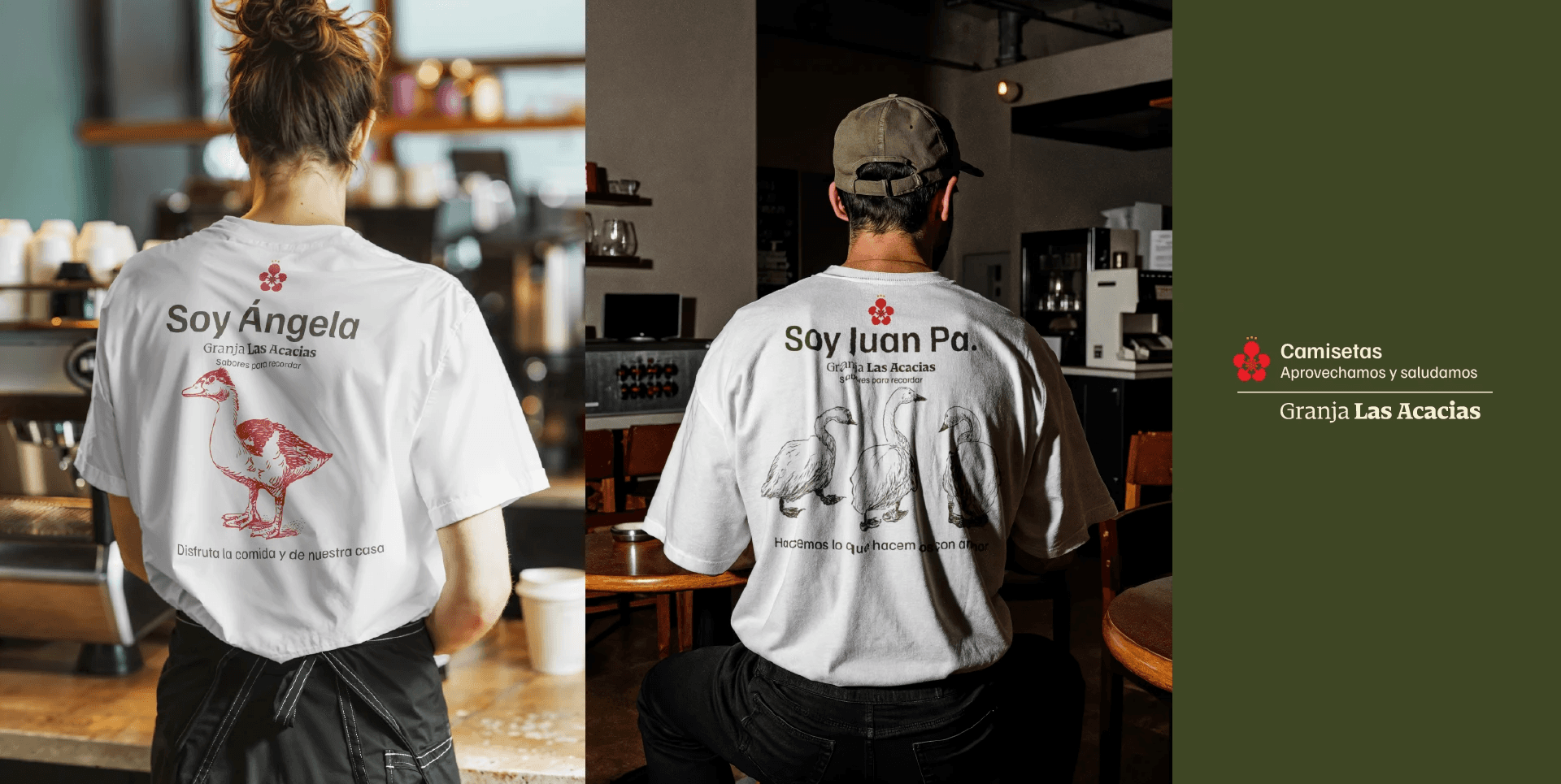
Humanized Uniforms & Apparel: Personalized aprons and greeting t-shirts ("Soy Ángela" / "Soy Juan Pa") that break traditional service barriers.
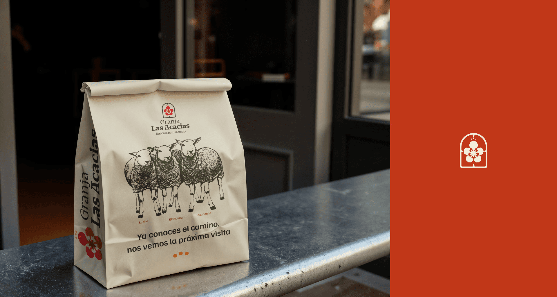
Packaging with Narrative: Custom pizza boxes and product bags decorated with detailed vintage biological illustrations of farm animals and family recipes.
"Here, abundance is born from affection and the land. Visitors don't just eat—they leave with a profound sense of belonging."




Were you our client and lost your files?
→ Request them here
← Back to projects