Strategic Renaming & Brand Identity System – Industrial / Petroleum Derivatives · Market: B2B, Latin America
The Problem
A Colombian manufacturer with 50 years of operation was introducing itself to industrial buyers as «Vaselinas Industriales de Colombia» — a name that referenced a single commodity product (petroleum jelly) and confined the company to one country and one category. In practice, the company produced a full portfolio of petroleum derivatives: lubricants, white oils, cutting fluids, and specialty compounds serving procurement teams across manufacturing, mining, agriculture, and infrastructure. The name wasn’t just inaccurate. It was actively limiting the commercial conversations the company could enter.
The Process: Listening Before Designing
This engagement started where all serious brand work should: with a diagnosis and a structured focus group.
Before any name was proposed or any visual system sketched, we mapped the human infrastructure of the company — the relationships between plant operators, lab technicians, commercial teams, and the founding family. The focus group wasn’t just a research tool; it was a calibration exercise. It let us understand what the brand actually meant to the people who had built it, and what it needed to mean to the buyers who would trust it going forward.
From diagnosis, we moved into naming. We developed and tested multiple candidates — VIC, VICOIL, Vitroil, InduVIC, Inducoil — evaluating each against semantic clarity, cultural resonance, trademark availability, and scalability as a brand architecture platform. Candidates were validated through naming testing with B2B procurement profiles, checking for phonetic strength, sector fit, and international neutrality.
We ran RUES verification (Colombia’s official business registry) and cross-referenced against SIC and WIPO trademark databases across relevant NIZA classes. VICOIL returned zero conflicts.
The Solution: A Name Built From What They Already Were
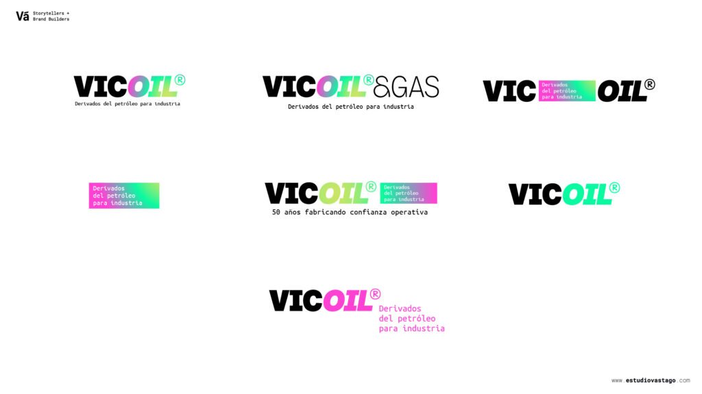
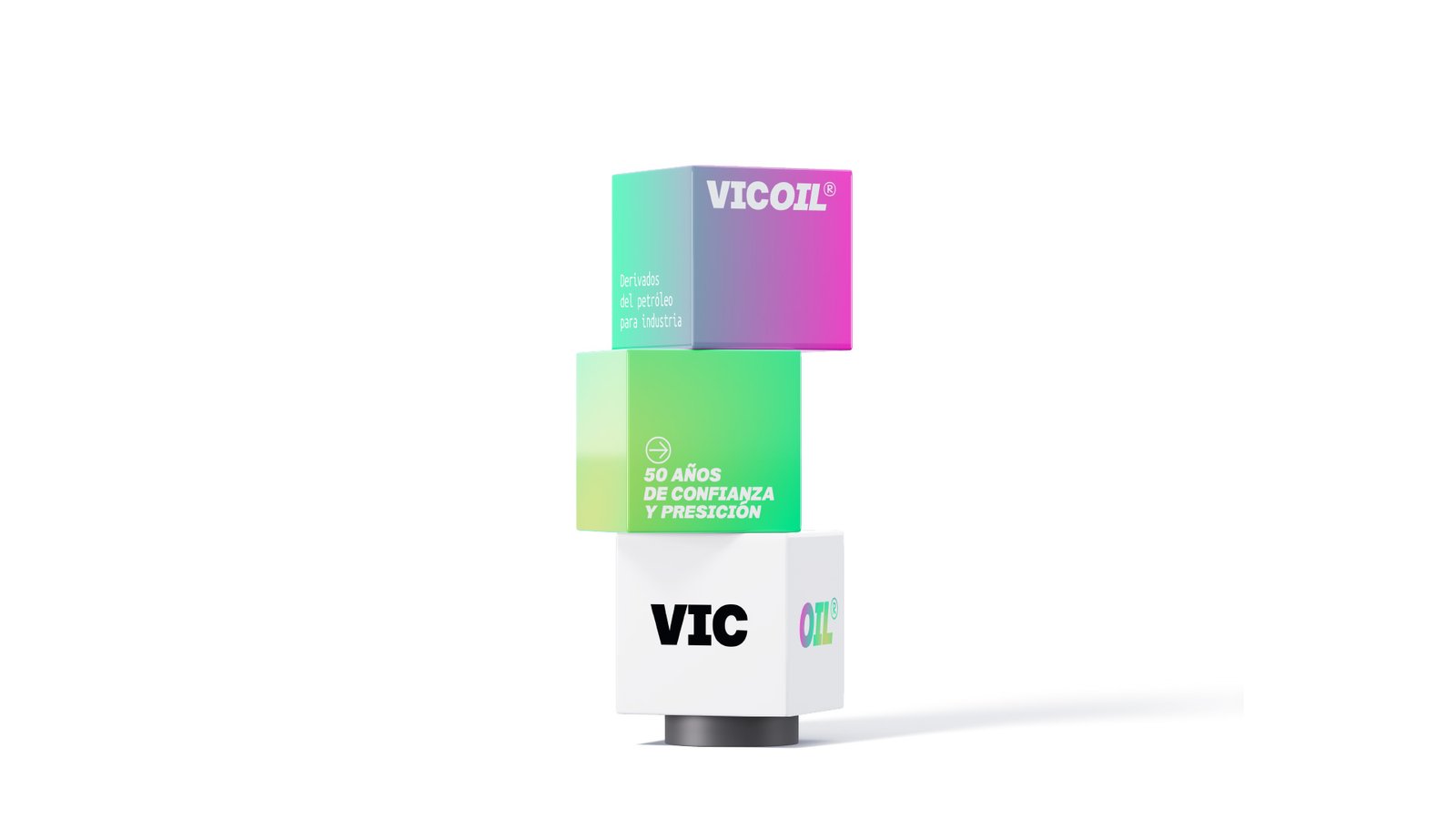
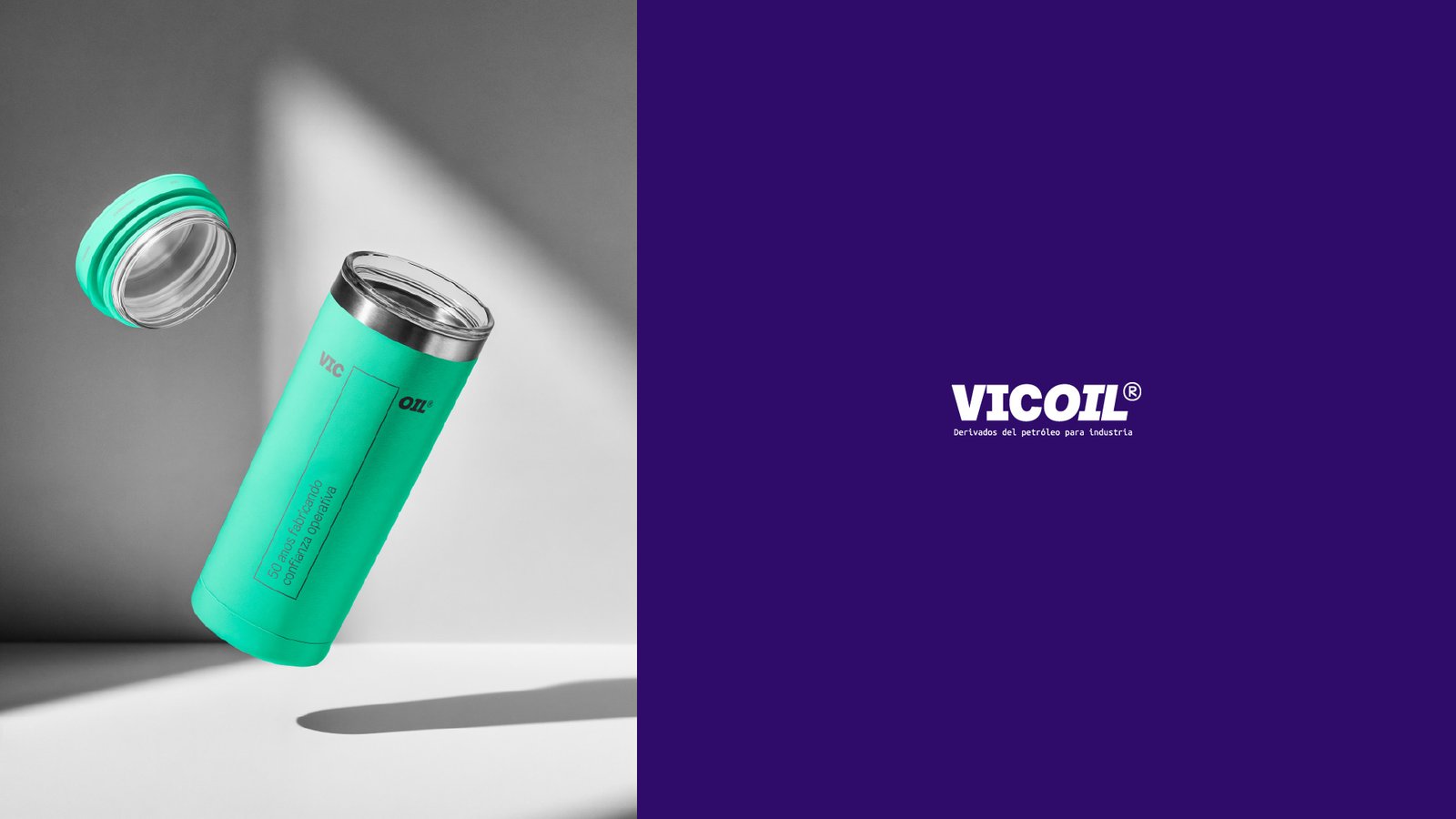
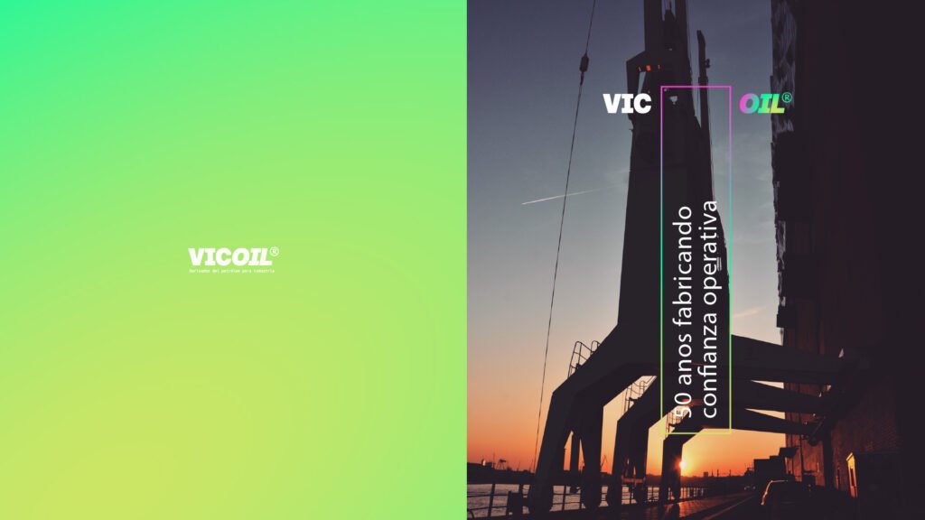
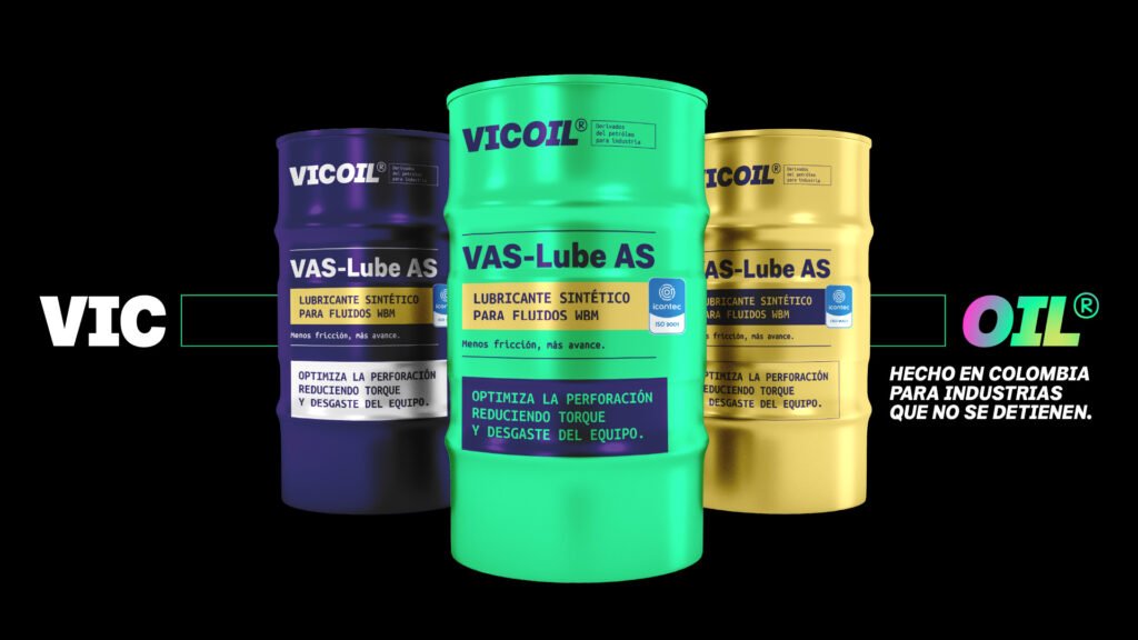
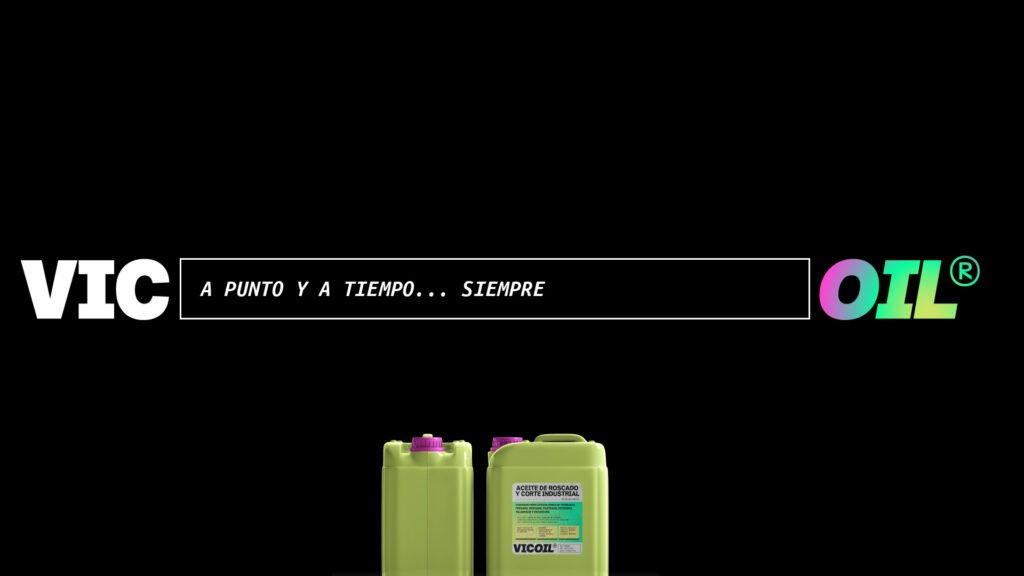
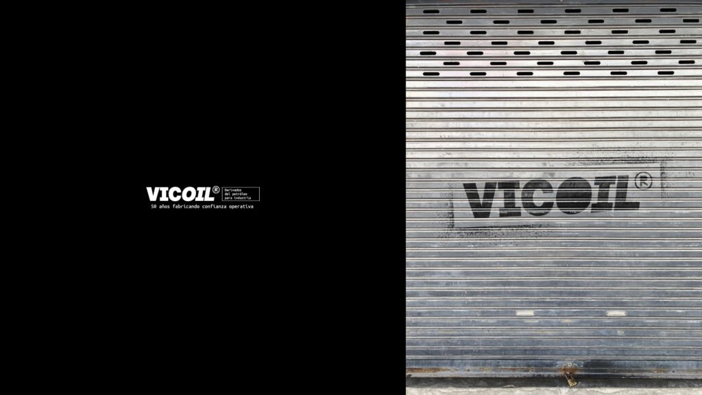
VICOIL is a sigla-based name: VIC (the initials of Vaselinas Industriales de Colombia, preserving fifty years of institutional memory) + OIL (a direct, universally understood sector marker in the global energy and industrial lubricants space). The construction is simple, strategic, and honest — it doesn’t erase the past, it encodes it.
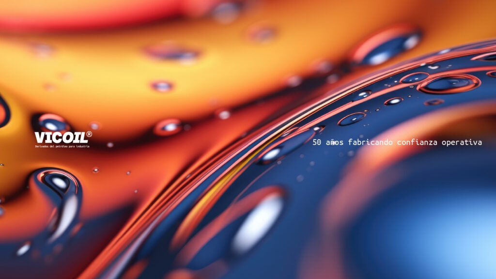
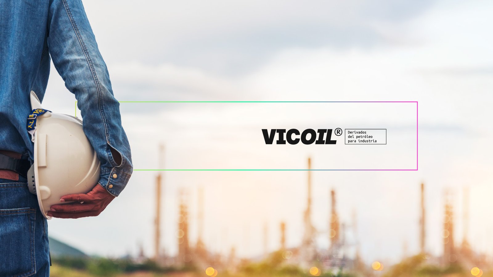
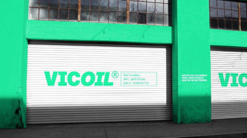
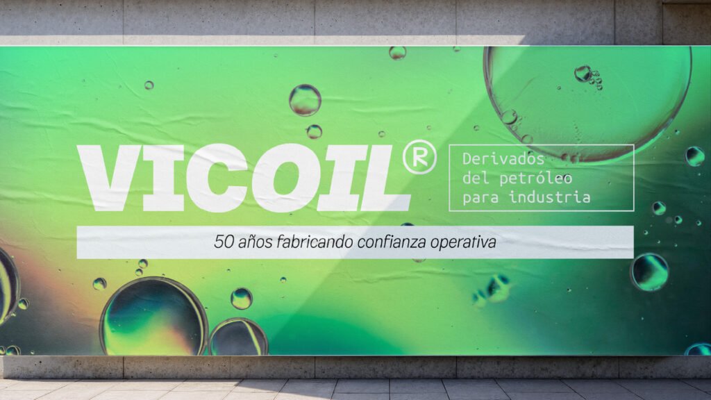
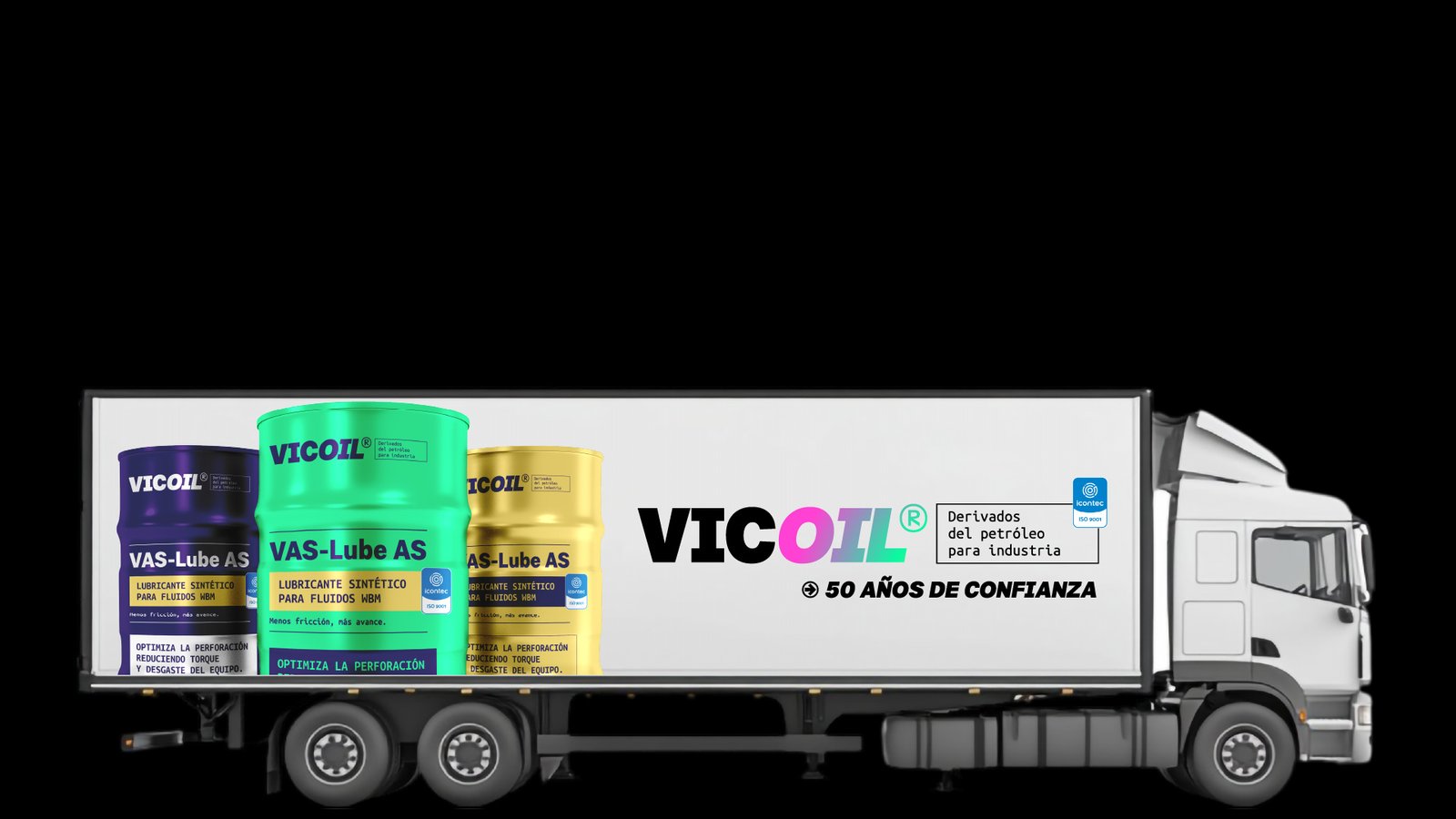
The corporate line was defined as «Derivados del petróleo para industria» — precise, descriptive, and category-owning. A brand transition claim — «50 años fabricando confianza operativa» — was crafted to bridge the name change for existing clients over a 6–12 month endorsement window using a «by VIC» architecture.
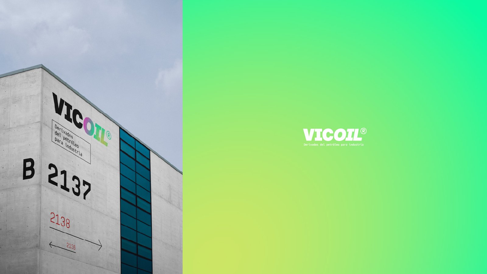
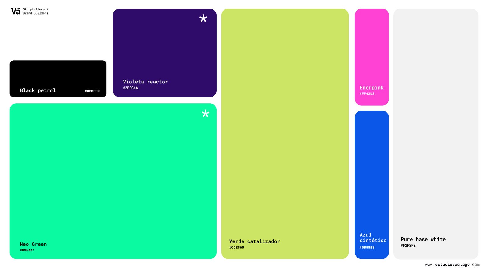
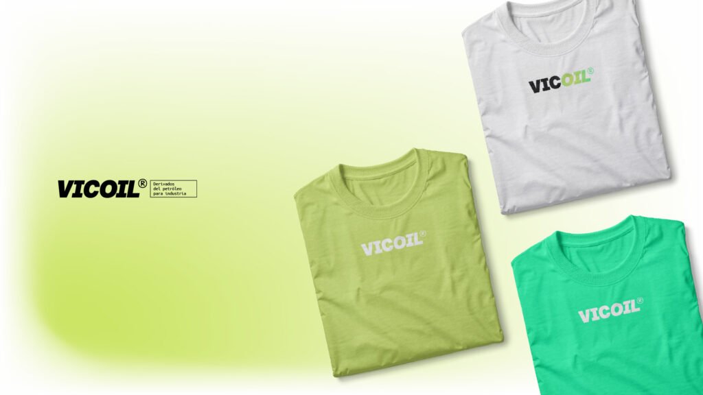
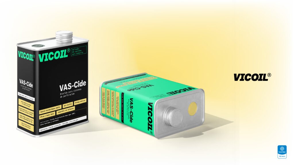
The visual identity was built to reflect both industrial authority and long-term scalability. The logo system was developed across multiple lockups, supported by a proprietary typeface — Quilichao Grotesk — designed internally by our studio specifically for this identity. The color system spans seven purposefully named values: Black Petrol, Violeta Reactor, Verde Catalizador, Neo Green, Azul Sintético, Enerpink, and Pure Base White.
The brand architecture was designed to scale: VICOIL as the master brand, with subfamily nomenclature (VICOIL&Gas, VICOIL·Industry) already embedded structurally.
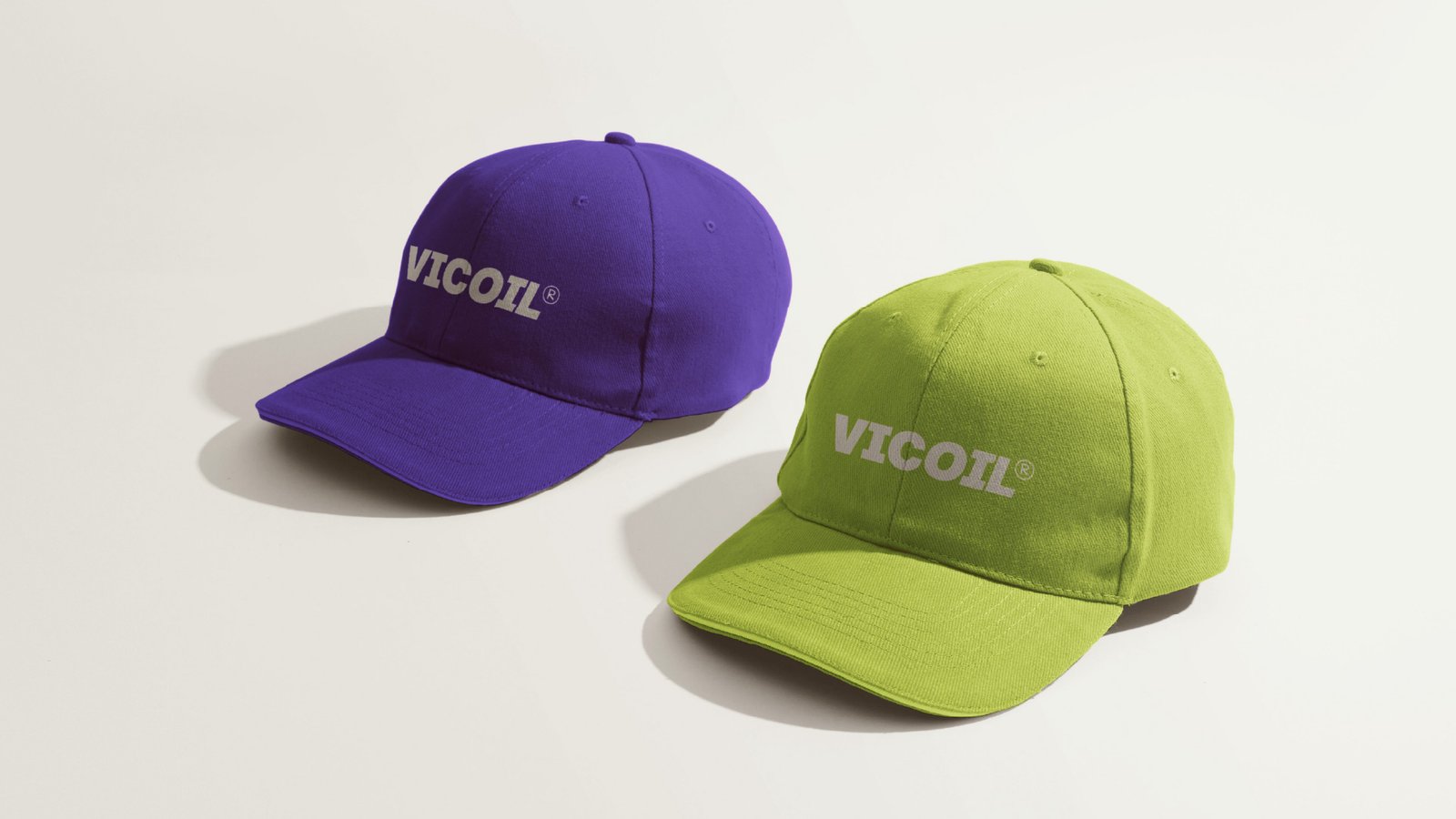
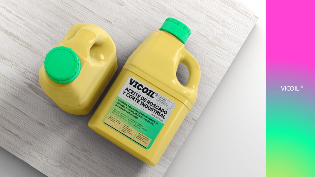
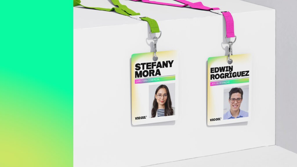
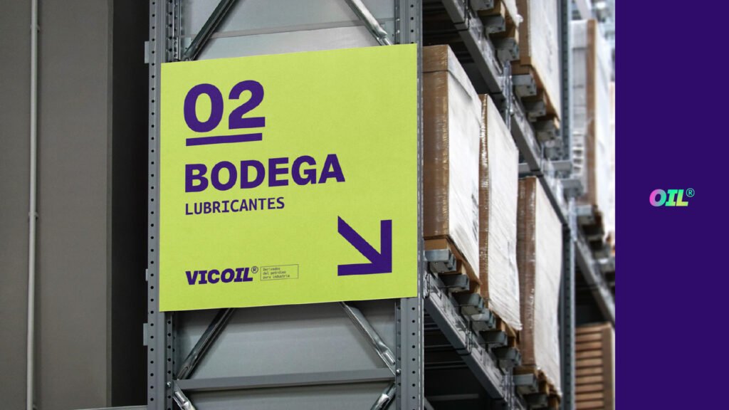
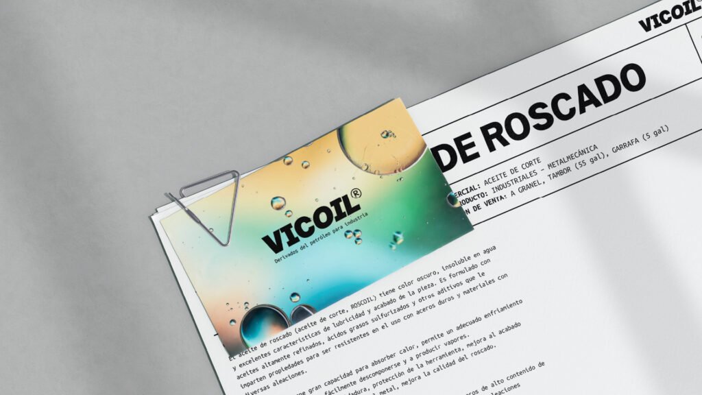
Full deliverables included: brand diagnosis, focus group facilitation, naming development and testing, trademark due diligence, visual identity design, logo assembly, custom typeface application, brand applications (packaging, vehicle wraps, uniforms, signage, stationery), and a comprehensive brand guidelines manual.
The Result: A Brand With a 50-Year Foundation and a 20-Year Ceiling
VICOIL is not a cosmetic update. It’s a strategic instrument — a name and identity system that accurately represents what this company does, positions it for B2B procurement at scale, and gives it the structural capacity to grow without outgrowing its brand.
Deliverables & Measurable Outputs
- 6 naming candidates developed and evaluated against semantic, phonetic, cultural, and registral criteria.
- 0 trademark conflicts — VICOIL cleared across RUES (Colombia), SIC, and WIPO in all relevant NIZA classes.
- 2 brand subfamilies structured and ready to deploy at launch: VICOIL&Gas · VICOIL·Industry.
- 7-color system developed and semantically named (Black Petrol, Violeta Reactor, Verde Catalizador, Neo Green, Azul Sintético, Enerpink, Pure Base White).
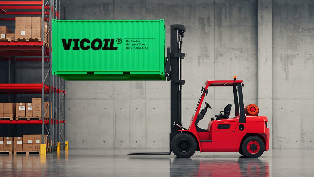
- 8+ brand application touchpoints designed: industrial packaging (garrafas, tambores, IBC containers), vehicle fleet, uniforms, signage, and stationery.
- 1 comprehensive brand guidelines manual delivered — covering logo system, typography, color, tone of voice, and transition protocol.
- 6–12 month transition roadmap with «by VIC» endorsement architecture to protect existing client equity during the name change.